Thursday, 30 March 2017

Final Front - Album Cover


Basically, for the final product, I went through three stages. I included the text that was used in the music video's title. I then hand-drew and photographed assets such as the text and the ooze from the eye as to make the album appear more indie, as Jack is not necessarily professional or attached to a major label. The title and bottom text remained yellow as a means of relating back to the video, this decision aiming to create some synergy between the two pieces and therefore relate them back to one another for promotional benefit - people recognise and associate the video with the album or the album to the video.

In the first image, you can see the text is included but not finalised and the ooze is not yet concluded however as we move down the images it slowly becomes apparent that the ooze asset was included and all the relevant materials were recoloured and resized.

The Weird Sky text was resized in the third image as I included the 'square' previously discussed on the blog. The square relates back to the psychedelic artist Tame Impala, however it also helps to focus attention to the eye on the album and otherwise accentuate the design and what it is showing. In doing this, I think the border helps bring the album together and is a great addition to the final product. The final design is included below:


Tuesday, 28 March 2017

Front Designs - Album Cover

Following the design process and feedback from many people, I decided to use Photoshop in order to further develop a psychedelic front cover for the Weird Sky project. Notably, the key images used are an eye - the photographs being taken by me - however the sky uses a number of layers.

The First

In this first design, I decided to saturate the images a lot more - hoping the vibrancy would make the design eye-catching and conform to psychedelic convention. The colour of the sky remained blue as to clearly show it was a sky, in fact I ensured some of the ground was also visible so that the horizon would again reinforce that it is a sky.  The continued use of the sky as a focus point is in order to relate back to the title of the project (Weird Sky), the colour perhaps also reflecting the title too as the high saturation lends itself to being 'weird', especially since the images are fairly mundane originally. Furthermore, the eye being edited into the sky helps to make the album appear more abstract and again 'weird' - to conform with conventions of the genre. I suppose that in some respect, the orange and blue in the design contrast enough to compliment one another and help draw focus to the eye. In terms of if I like this design, I feel that the eye's inclusion felt too jarring and didn't blend well into the image, so I decided to change this in later designs. However, while I standby the inclusion of blue to keep it looking like a sky, I feel that such a choice would be unique enough to be the final choice; Jack decided that perhaps the incorporation of different colours might help with the final decision so I underwent some more design ideas.


The Second

This second design, features a more pastel or soft colour palette. This choice came about by looking at a Tame Impala album cover (the one for Innerspeaker). Tame Impala's album still includes text in the corners but, as previously decided, I will not be pursuing this design idea for the text. A notable difference between this and the first is the eye being turned around; by turning the eye, the pupil feels more central and therefore has more focus drawn to it in relation to the rest of the album. However the white of the eye is still larger than the left, the lack of symmetry being an issue as there seems to be a lot of focus placed on symmetry through kaleidoscopic imagery and even the Tame Impala album I looked at - which featured a repeated image creating a perspective illusion of sorts. I decided to continue experimenting with colours as this palette seemed interesting but the pastel choice needed to change - likely making the cover more vibrant, like in the first design. Additionally, the eye could perhaps be better centered in some way. Below is the Tame Impala album in question:


The Third

As a follow on from the previous design, this clearly features the use of the same colours (purple, green, orange and so on). In this, I think the colours blend together very well and it is still clearly a sky; there are a number of colours that blend in this design which certainly works on its own but the music video was a little more selective in using a handful of vibrant primary colours in the edits - maybe something I should consider. As a result, I decided to again try reducing the number of colours involved in the palette. In terms of  the imagery, the sky remains untouched but the eye was duplicated and overlaid over each layer to create a more symmetrical eye. The focus on symmetry here adheres to convention as previously noted but also makes the central image rather uncanny as it is close enough to a real eye but is clearly different slightly; due to this, it becomes unsettling and furthers the abstract design which I think was a great idea and will definitely continue into other designs.

The Fourth

I've struggled to decide on a palette and here I've been more selective and returned to the blue and orange, simply opting to make the blue less saturated but I don't think it works. The issue with this design is that it doesn't pop out enough, suggesting I perhaps need to look into a more vibrant choice of colours. I think the eye still works but could need some more fading. Overall I liked all of the designs up to this point but the fifth is what Jack and I decided on, therefore making it the front design that went on to receive more work - such as the inclusion of text and the 'leaky eye'. A screenshot of the conversation being included below:


The Fifth

For this design, I was rather frustrated with my inability to decide on a colour palette and just went a bit crazy with the design. I included a lot of additional layers of sky that I did not blend properly, leading to the long prominent cut lines and pixelation. The pixelation also comes as a result of the severe saturation and colour manipulation the design underwent in Photoshop. I made sure to blend the eye more but keep the white more or less visible. In the end, Jack decided he liked this one more and so I went further with this design idea; the colour palette actually relates to the video very well as seen through the use of vibrant green and hot pink, plus these are the colours I highlighted as complimentary in my post about palettes - being inspired by artist Jack B Coulter who has synaesthesia. 


The Sixth

Jack decided on the colour palette and basic design, however I decided to pursue a more pixelated design. With the fifth design, I included some long lines to cut and splice different tones of saturation and came up with a design that intentionally accentuated the distorted digital appearance that was apparent in the fifth design. I suppose the distortion comes as a way of reflecting the content of the album and the genre as it distorts one's perspective and - as seen in the music video I produced - clearly links to the digital effects at the end. The intentional use of these lines just reinforces how Jack, as an artist, is not too focused on looking 'good' or professional and sleek; the design is vibrant and fun and conforms much to the psychedelic conventions with appearing abstract in its imagery and colour choice. I suppose the colours also act as a homage to the Pop Art movement that influenced much of the work in the psychedelic genre too. In some ways I think that the colour choice does downplay the fact that it is a sky, however, more dedicated fans might be aware of the real image used and it could act as a means of building a connection through surveillance of information - as noted through Uses and Gratification theory.

Thursday, 23 March 2017

Draft Reactions - Album Cover

After asking around, I've managed to get a lot of verbal feedback and have recorded 2 encounters below. The third video is of me explaining the results of talking to a table of girls, in order to uncover a female perspective. However the third video does not include the girls as they weren't comfortable with being recorded, even through just audio. In fact, I did get a lot of feedback from guys but was unable to record as they were being unprofessional - swearing and disrupting the recording by snatching the phone. As a result I have little video evidence but nonetheless the feedback was helpful. Notably one of my male friends, Mo, was pretty shy but Daniel was rather unhelpful in his attitude so apologies.


Essentially I learned that there was a preference for design number 4 but certainly most of my predictions proved true in terms of what people would think about each design. There seemed to be a clear confusion in regards to the eye and so I think it is perfect in terms of psychedelia as it is abstract. One point to raise is how my favourite design proved to not be as popular as I thought it would be, which is fine I suppose. Nonetheless, I will have to develop some covers based around this plan.

As a matter of fact, Jack also offered an opinion and his certainly counts as he is effectively the client.


Wednesday, 22 March 2017

Design Drafts - Album Cover


I drew up some initial ideas for the album cover and they are shown below. I will be discussing them by number with the top left being 1, top right being 2, bottom left being 3 and bottom right being 4. I will also be going around asking people for their thoughts in school.

1
This design is rather reminiscent of Weird Sky and as a result I've decided to include a sky in the background to maintain that key image. The one thing I've tried to do is include some Dada style with the potential for manipulating a real image of Jack and having the head open up to reveal some goo exploding from it with Weird Sky written in the goo as it is also sailing through the air. It's quite imaginative and surreal but I am hesitant to include Jack's head as the primary image in another album. I do actually like it a lot and think it's the most developed idea, but I am still open to feedback and will soon see which design is best. My one issue is the text, the Weird Sky is perfect in terms of the style as it is based on the design I used in the music video, however the placement of the Elsewhere Head seems off to me - perhaps centering it would be better.

2
This idea has Jack on the album but as a silhouette, more of a call back to the original idea I had awhile back when we initially thought about creating the Weird Sky album. Notably I chose to keep the lenses of his glasses white as to make his silhouette distinguishable. However, I think it's too lazy and doesn't feel as trippy as the other ideas. Sure editing the sky to be psychedelic and abstract might work but I feel there are better ways of following psychedelic convention.

3
This image is just a goblin, it is extremely unrelated to the album but I think it looks cool. This is effectively the style Thee Oh Sees would follow in having their cover not relate to the content or title of the album, it's just effectively a random illustration that is psychedelic in its detail and abstract concept. This is perhaps similar to the fish design I made for Shit Music but clearly that had some possible symbolism behind it whereas this is an irrelevant image. One thing to note however is the position of the text, the position is similar to that of Tame Impala's album. Typically the artist leaves his name on a circular sticker over the front cover but on the cover shown below the text is in the top corner - a possible placement I have considered as he is a psychedelic artist.

Image result for tame impala album


4
This is a design that I am conflicted about, it could certainly be improved by adding the text from design number 1 but at least it has centered text. I am unsure about the placement of the clouds actually, I might just have it oozing some goo as to relate to the lyrics in Mystic Optician along with the art for that album. Also in terms of the clouds, I am not sure whether or not to include them so prominently, would I have to illustrate them and add them to the cover or would a simple photo image do? I am unsure but there is definitely potential in this design.


Monday, 20 March 2017

The Square

As mentioned before, Ty Segall included a white border around his Melted album. Well, I've realised that a YouTube musician I listen to called Telic also does this with his images on YouTube, but even better Tame Impala also does this.


This really brings together the product and makes it feel more professional to me, notably they do have their text in the center but I will still keep to the text along the top and bottom of my album cover. It is quite likely that I will include some image in the center as to draw focus to it.


Below is also Telic's channel to showcase the repeated use of this border style:

Saturday, 18 March 2017

Digipak - Album Template

I found a great website called Discmakers who have included a free downloadable template for album covers. I've decided to go with a simple four sleeved template which includes a spine too. The template comes with some guidelines in which to place each cover and where the final product will be folded.


Wednesday, 15 March 2017

Back Cover (2/2)

On the topic of the back cover, I do have some images that I took of Jack against a wall in a similar fashion to my media classmate. The inclusion of the brick wall is to keep with music convention as artists are genuinely photographed against brick walls, namely rock and punk artists. One such example is the Ramones, a band of whom I and Jack are fans of.

Image result for the ramones

Perhaps the inclusion of the brick wall could be related to psychedelia in that Pink Floyd's album the Wall featured a literal white wall. As such the use of bricks on the album could act as a very minor reference to the band who are widely regarded as pioneers of the psychedelic genre. Although, the album cover I will be designing will likely not be so minimalist in terms of the colouring.

The album cover, a plain white brick wall

Image result for the wall pink floyd


Photos of Jack:


These photos are quite good but I think I will be using the second to last one as the is lots of Jack's body in the image to work with, however the last photo does not have the pipe in it and so that might also be worth considering. I think the quality of the photos is good enough, it's just a matter of editing it and adding the parts I've designed in the previous post. I will namely have to transfer the text by writing it by hand and then tracing in Illustrator as I am not convinced the lines will be thick enough is simply photographed and added to the image.

Monday, 13 March 2017

Back Cover (1/2)

Henrietta Harris' art is something I came across whilst studying the subject at GCSE. Notably she works with water colours and produces some very abstract portraits to symbolise distorted perspectives.

The image on the right is the one tat I saw first and I like how his eyes are removed through the liquifying. This is something I can emulate in Photoshop and decided to include in my design idea for the back cover.

Her art is not necessarily psychedelic in terms of the colours used but the content of the imagery certainly lends itself to the trippy designs often included in psychedelia. As a result, I will definitely be using Harris' art as inspiration in producing the back cover, which I think would be great with an image of Jack leaning against a wall - as to fit with the stereotypical rocker photoshoots that people like the Ramones did.


My Design for the Back:

My photos
Left is a normal picture of a media classmate but the one left has iPhone effects such as the 'enhance' option to better replicate Harris' palette, the pastel look is something that I will likely change in the future though.


Below I have included a rough design idea in which I experimented with my classmate's image by liquifying in Photoshop to replicate Harris's work. One thing to note is that is certainly looks psychedelic and trippy but I think I should consider layering different versions of Jack as to make different coloured layers of the liquified parts. Also the image will be of Jack in the future.

The green goopy ooze style of the area containing the track list is just to fit in with the melted look but I suppose it fits with the goop that escapes during the music video as well. I substituted some fact titles with a random font in order to clearly represent where the text would go. In the final version, I think that making the text hand-written would make it seem more indie and allow for me to control what it looks like, just like on the front of the album. I will have to write out the full album list after Jack has developed the recordings; I originally pitched the project with this being an EP and thought I would have to add some songs to the list in order to make it a full LP but Jack is luckily intending to make it a full album anyway.


Friday, 10 March 2017

Album Covers (3/3)


Jack originally sent me a design for Weird Sky a few years ago, before his Elsewhere Head stage name came about. He sent me a rough sketch which showed him sitting in a field and how he wanted a Weird Sky to be written behind him presumably with some editing done to make the sky look weird. He then sent me photo which you can see below to help me plan out the design but we never got around to it.

I will say that I was considering making Jack into a silhouette for this album cover and making it look somewhat like the Jack Johnson album I discussed in the previous post. However I have since had time to reflect and believe I can come up with an album cover which is more psychedelic and in-keeping with Jack's current style of music.


What I did at the time:

Image result for death of a bachelor
I originally came up with a small idea by drawing in my iPhone setting in Facebook. I included some lines across the sky and believed I could edit the sky to look 'weird' through this means. This idea mainly came about after listening to Panic! At The Disco's album Death of a Bachelor; in the album the original image is drawn over digitally and so I wanted to emulate that.

However, upon reflecting upon this idea, I believe what might be more professional is simply editing over an image of a sky and saturating it. Maybe layering it over another image of the sky and perhaps including some sort of psychedelic imagery such as an eye. With this, I would be able to keep with the key image of the sky and maybe add to the cover with an eye as to represent the weird aspect further, maybe even relate to the lyrics for Mystic Optician.


Album Covers (2/3)

The Shit Music EP was something I worked on with Jack. Here I have included a line drawing which I then filled in with some other colours for the final product. I created the cover in order to represent the idea that Jack is 'sick' of shit music within the industry. The album acts as a rock opera of sorts that highlights the story of a man who is disgruntled with the music industry and then finds a singer to work with him who promptly abandons him and goes on to sing corporate music which doesn't feel as genuine.

Image result for jack johnson albumThis idea came about from making a series of brief sketches before settling on the head sketch, which I better refined to look like Jack. As a matter of fact his glasses hold some detail which were on his old spectacles which he has since replaced. I made sure to get Jack's distinct hair and glasses which I think helped with implementing into the logo I have made.


Additionally,  I would like to note that in terms of the colour the choice for a yellow background came about from listening to Jack Johnson's album In Between Dreams. In fact I was partly inspired by it which I will talk about later.

Another point to raise is that Jack didn't include the 'Jack Calvesbert' as this was when he started to foray into the stage name of Elsewhere Head. Another point to raise is that Jack printed out some albums himself but they do not contain a back cover, therefore whilst he does not require one I will still make a back cover for my project.


I sketched out the final design and then took a photo which I drew over in Illustrator and coloured in Photoshop, however since I included an illustrated image of Jack's face in this album I believe my new design should not be similar. I have decided to not include Jack's face on the front cover of the new album as it might seem narcissistic or otherwise not distinguish it from his older work. This is a new release and should therefore be distinct.


The Other Designs:

One
This first design saw me include Jack's iconic glasses with the title coming out behind and in fact the text looked fuzzy because I wanted to make it seem more organic.

Additionally, the text is connected by a stem which is included as a means of otherwise signifying the concept of the album originates from the glasses (which represent Jack). In terms of the striped lenses and the goo which seems to come from the glasses, I suppose that I just added it because I would be able to fill it in with colour later on and so wished to incorporate as much variety of colour as I could - since Jack specifically asked for it to be colourful.

He didn't really tell me what to put as an artist name and so I put Jack DC because those are his initials, this was mainly due to the fact that I didn't have enough space on the design to write his full name.

Two
This design features a fish-like creature eating its own tail. I thought that this infinite paradox symbolised the recycling of music which the EP seems to indicate. The idea was more of an after thought as I initially just started drawing the fish's eyes.

I included a lot of detail in the scales and the drool but in terms of the fonts not really. I went with bubble writing and actually failed to include Jack's name on the cover. While he did like the design he just felt as though it wasn't related to the actual album enough. I suppose that this reinforces my decision to not follow the design choices of Thee Oh Sees who include cool but unrelated images in their album covers.
Three
This inspired the final design and essentially what I removed from it was the border and the neck of the character. Additionally, while I started with no eyeballs in the character, I soon changed it and gave it glasses. The inclusion of the glasses made it look more like Jack and helped to make the image feel less uncomfortable as it was quite eerie having the eyeballs melt away.

The text can be found in the mouth of the character to show that the music is what comes out of his mouth, otherwise suggesting it is not 'shit' music. Additionally, the decision to get rid of the portrait was simply because I felt that it wasn't needed - which Jack agreed with.

The text was also later changed to Jack Calvesbert as I was able to fit it in after tracing in Illustrator.

Thursday, 9 March 2017

Album Covers (1/3)

These are Jack's covers in chronological order. He's always had an interest in producing music and so I thought to look at his older products in order to help influence my decisions and designs for the Weird Sky album. Jack originally worked under his real name but has since decided to name his solo project Elsewhere Head. Below I will also be discussing some work he has done on Bandcamp with his other bands "The Complete Series" and "Surf City".


The Mechanics of Parody
Jack's very first album from Year 7, it is kind of a mess in terms of the composition and in fact the font choice was very basic and doesn't stand out - the colours likely needing an outline over the photograph used for the front cover. The fonts are extremely chunky and it is difficult to read the track list as they're not spaced out. One thing to note perhaps is how he is rather consistent in having his name after the title of the album, which I will likely keep in the new design. I also like the use of the yellow text in the sky, the yellow contrasts well with the blue. I have said it is hard to read but I think yellow text will be really eye-catching if given an outline too.

Redone Radians
This album cover was designed by a mutual friend of me and Jack, his name is Andrew. He is interested in graphic design and so Jack sought him out for help making the cover. What was done is rather basic but keeps a consistent palette and the cell shading is quite distinct too. The composition is great with the title and artist name being clear and central, however I think that for this more psychedelic album the text should be hand-drawn - this would allow me to have some more control over what the text will look like. In fact, I will likely use the same font I drew for the music video title as to maintain come iconography.

Generic Blues
This cover is a mess, it was created by Oskar who is the latter half of the Complete Series. The cutting on the individual images is really prominent and there is perhaps too much on the cover for it to really be appealing; notably the text's font clashes with the background and is difficult to read as a result - albeit the font chosen is also rather difficult to read anyway. Overall there isn't much to discern from this album cover.

The Attic
Again, this particular cover is quite amateur. I don't believe the composition is very well thought out and there is a distinct lack of colour due to it being drawn with a biro. This is likely due to it being a last minute album and the cover is therefore also impromptu; notably it is titled the Attic but the cover says Attic Deep just to add to the poor planning implication. There is very little I could or would want to apply to the final album from this design.

Surf Girl
The photoshop work on this album is pretty good, it manages to make the unnatural colouring of the water at the seaside in the image blend in naturally. It subverts the realistic expectations for the image by adding in some rather surreal water to contrast to the otherwise untouched parts of the image. The one issue I found was the text which appears to be quite unclear and pixelled; the writing is done with a thin brush and therefore the lines are very clear. In fact, despite having such a vibrant choice of text colouring it is difficult to see the writing as the text was made quite small. I suppose the size of the text is something to better consider.

Shit Music
I will release a separate post about this design.

Mystic Optician
Some of Jack's original artwork, the text is much clearer than that of the Attic but again still looks unprofessional. There is not much cohesion to the cover and it is rather unappealing overall. I would include Jack's face on the album  but feel the sky imagery should be more prominent than Jack's face. One thing to note actually is how the central eye within the mouth seems to have some lines coming out, this perhaps relates back to the line "You make my third eye bleed" from Mystic Optician, which I could perhaps include in my final design as this track will be included on the final album.

I Love My Hate
The image is minimalist in some respects just like the Pink Floyd work I looked at before, however there is no text to help inspire my design. I think that the inclusion of text is needed and actually I would like to include more colour than the design shows; I would note that as an inside cover, this style might look great if the inner sleeves were perhaps semi circles which joined in the center of the album.

Weird Sky
This is a proto cover that Jack included as he wished to release his album earlier, other than that there is not much else to say since Jack decided he would later use my own album cover once it was made.


Monday, 6 March 2017

Inspiration for Covers

Psychedelic conventions are surrealist and contain a lot of kaleidoscopic imagery and so on and so forth. Other influences, as noted through wikipedia, seem to be the Dada and Pop Art movements. So in terms of the design I think incorporating real images - as in Dadaism - would be something to definitely consider in making my album cover. Additionally, I should find some vibrant or saturated colours to really pop out and grab the attention of any possible consumers.

Thee Oh Sees seem to have a lot of illustration in their album covers, notably their covers do not really relate to the album's title or really the content of the album. The illustrations are likely something I can do, as I have in the past for Jack's album covers, but I do not feel as though much should be used in this design. I've noticed that one of Thee Oh Sees' albums contains a lot of eye imagery, something I should definitely consider integrating within my own designs.


Ty Segall is somewhat psychedelic in his album covers but notably mainly uses coloured photography within his work. One of the most notable things I've noticed with his work and that of Thee Oh Sees is how they haven't included the title of the album really on their covers but I think it is needed on Jack's work as to just reinforce his identity and the overall theme within his release. Another point to raise is Ty Segall's inclusion of a white square that acts as the border for his Melted album on the left below, this is something which I could certainly feature in my final product in order to just accentuate the imagery I use.


King Gizzard and the Lizard Wizard are all drawn and painted too. Their designs are a little too intense for me to keep up with and so I think that producing some work influenced by them would be difficult. However, I have found a website which I believe is run by their artist and in THIS LINK the design shows is again complex; one thing I could glean from the website I linked is how cool the vinyl disc looks, I might actually have to take note in this regard and possibly design the inner cover like this because I just really like the marbled dotted effect. Also the band include their name more so along the top of their album work but I think my text will be the other way around: the title on the top and the artist at the bottom. Essentially this means the 'Weird Sky' is located at the top of the album which fits with the connotations of the word "sky".


In looking into album covers I believe that assessing two of the most iconic psychedelic albums would be great - especially since Jack has cited on of the artists as an influence. The Beatles did Sgt Pepper and Pink Floyd did Darkside of the Moon, these two album covers being at opposite ends of the psychedelic spectrum. On the one part, Sgt Pepper includes an immense amount of colour, coordinating a photograph such as that would be difficult plus Jack is a one man band essentially which means using his image repeatedly would require a lot of editing. I do appreciate the vibrancy though, which is definitely something to consider. In contrast, Pink Floyd's album is extremely minimalist, much like their other album the Wall; I would like to note that the simplicity allows for the rainbow to pop out but also this abstract imagery shows that I don't need to oversaturate the cover with assets and images in order for it to be effective. What I will likely do is adopt some aspect from each album: the colour and vibrancy of the Beatles with the simplistic design and composition from Pink Floyd.


Seems to be a focus on specific colours complimenting or highly contrasting for visual effect, see this web post about it. This post mentions Victor Moscoso who seems to use opposite colours such as blue and orange - which are opposite one another in the colour wheel. This means that using green and pink, which I've discussed as a palette before, would certainly coincide with psychedelic convention and is certainly something to consider.

Thursday, 2 March 2017

Final Cut - Weird Sky


Weird Sky Final from Eughan Wooding on Vimeo.

I've included the logo as an opening vanity card of sorts and then included it as a watermark to essentially give Jack some degree of branding. I think this makes the release seem more professional and brings about some cohesion to the project. This logo will likely be included across the digipak as well in order to reinforce Elsewhere Head and otherwise develop some synergy within the products.


The animated title looks great to me, very indie and authentic with the hand-made aesthetic. I think the font is very reminiscent of the Gorillaz but I would also like to note that I used the Cracked animated opening as a reference in order to create my own animation. The way it animates in and out is great as it means there is a natural transition in the animation itself.


I've edited the opening to be a little darker to contrast subtly to the later periods in which Jack's character is shown in the living room - these sections occurring whilst experiencing the 'trippy' effects of drinking the milk, which still acts as a euphemism for drugs. The sections post-milk-drink and pre-wake-up are much brighter and the contrast has been increased a bit too. I would especially like to note that I tried to really fix the action match cut at 0:12 and believe it is as clean as it is going to get, the only way to improve it might be to reshoot but unfortunately that isn't a possibility.


What  I haven't touched on is the over the shoulder shot of the television at 0:24; super imposing the colours onto the  television was difficult as I shot it at an angle, if I were to improve I should have shot straight on. I've noticed it is extremely wobbly and this is something that would be difficult to remedy given the handheld camera already required me to edit with key frames on a frame by frame basis. Additionally, I've improved this section in this cut by adding the static footage during the sections when the colour changes, as if to suggest Jack is flicking through empty channels to the beat.


I included some mild animation in the shot reverse shot section that appears after, the white lines appearing different on every frame to clearly make the viewer feel the section was jarring or strange. The inclusion of the animation here is in order to clearly establish the music video occurring within the music video is not what it seems and to build a connection with the animated sections that will spill over into reality later.


From 0:37 I included the shot of Jack playing the guitar in the overlay. This was in order to provide a focus piece within the sky clips. I think it works extremely well and perhaps the super imposition and overlaying here is reminiscent of the Kinks and Oasis, whom I analysed earlier in my project and Jack has cited as major influences.


Another note is that the use of the clones again harks back to my preliminary video in which I cloned myself using Premiere. The masks used are animal masks and I would especially like to take this time to reference the Beatles as an inspiration for this part, their I Am the Walrus helped me come up with the idea. Additionally, they are also cited as an inspiration to Jack and so I felt paying homage to them was necessary, especially given their developments into the psychedelic genre.


At 0:52, I've refined the animation segment here which originally had a static kaleidoscopic image that was a screenshot from the app I considered using. I have since changed it to a royalty free loop and edited the clip to make it more saturated. Additionally, I've edited in some clips of Jack dancing and walking into the frame in order to make it seem more interesting and add to the psychedelic aspect within the video. This section is then transitioned into the next stop motion and animated segment of the video - I used a wipe that matched the speed of the head that floats from right to left.


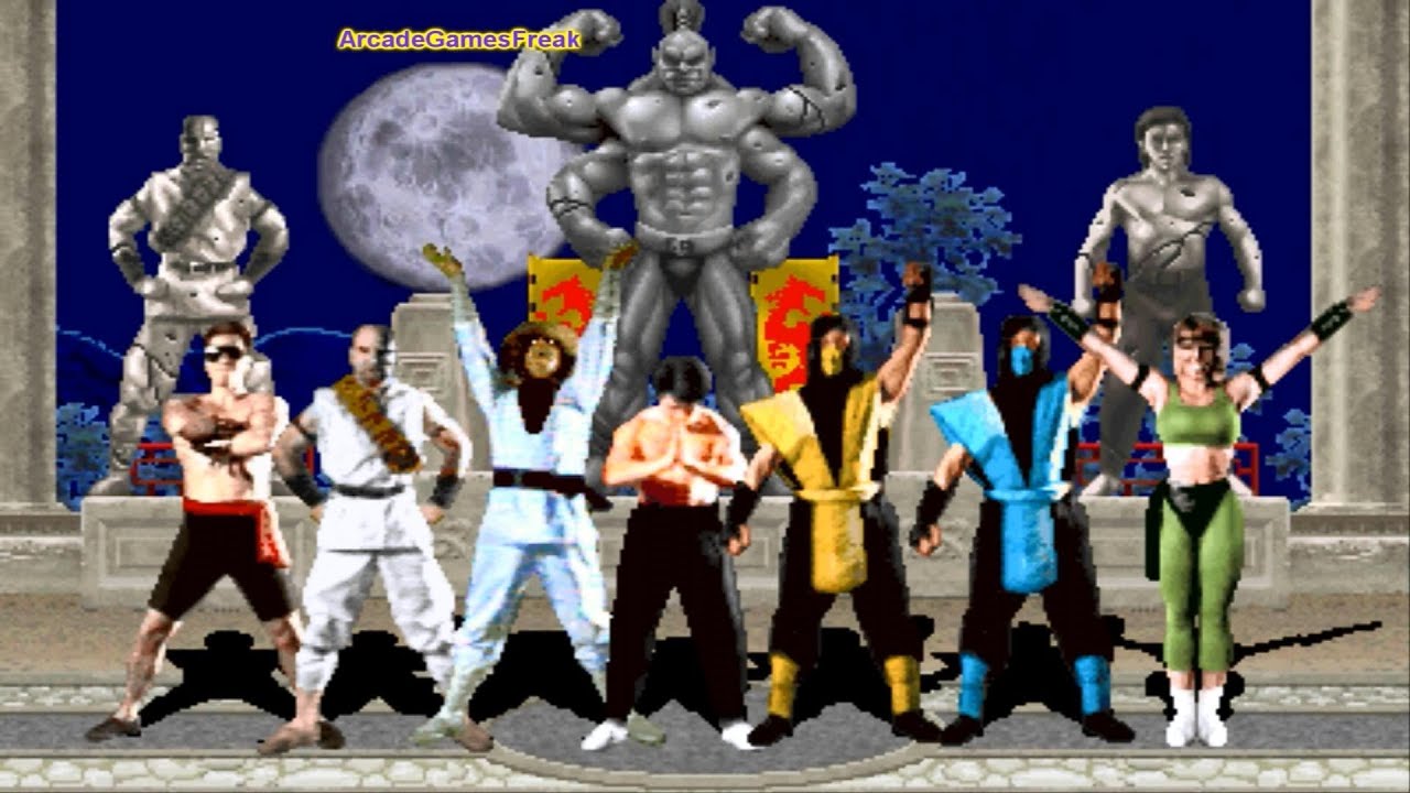
The blue psychedelic background is from the Snapchat filter I used on a lightbulb but recoloured to be blue. The stop motion of Jack was difficult to do to the beat but I believe I did it very well, one note I would like to make is that I would have loved to animate Jack's head coming out of his mouth for a second asset but unfortunately I've had to cut this section down due to the animation length. In fact the green and orange animation I added to my animatic. The criticism of the current animation I would give is that I believe making the image more pixelated like in the experimental video I made would improve the aesthetic, making it look like the retro Mortal Kombat games or even the Dada style as seen in Monty Python (below is a screenshot from Mortal Kombat).

Image result for mortal kombat 1

Moving on, the animation when the head rotates and subsequently spills animated liquid from its mouth is rather smooth in terms of the transition that occurs. I decided to have the blue screen fill up and transition into a sky as to keep in with the title and theme of the project. This section is one that I'm quite proud of for the creativity behind it, certainly keeping with the abstract ideas typically conveyed in psychedelia. However, if I could have spent more time on the animation to make droplets jump out of the waves more then I would - the amount of detail in the animation being something that might improve it.


I decided for the next shot to contain two clips of Jack looking towards the center of the screen as to break the walls in the narrative a bit as those are shots of Jack sitting on the sofa, the fact that these shots have assimilated within the music video that Jack's character is watching adds to the invasion of reality seen in this video.


The shot at 1:07 with the rotating heads in each corner of the video is actually a small reference. This is to pay homage to the influence of Pop Art within psychedelia. Notably each head has a slightly different coloured background in each corner, this was done in order to mimic the extremely famous Marilyn Monroe portrait by famous pop artist Andy Warhol. Another thing to note is simply that I again used a royalty free kaleidoscopic clip for this section - altering its saturation and contrast slightly.

Image result for marilyn monroe pop art

The clips at 1:19 have been altered to be brighter, as I've previously thought of doing in the Rough Cut 2 post. I removed the overlay that was on and managed to finish the animation; the hands start to flash as I was running  out of time and intentionally skipped out some frames to make a flashing effect, in order to maintain the clearly jarring situation and how it is something that is not real and Jack is hallucinating (as noted by the green disappearing). I would like to also make mention of the audio being changed at this point: the sound effect was changed to a ringing as to fit with the jarring return to Jack from the visuals within the television (the ringing idea came about because usually when soldiers are dazed in films or video games the sound is muffled and all the audience can hear is ringing). This was a royalty free sound effect so it would be fair use but also the music returns with a slightly less severe cut, as to better emphasise that the cut from the audio was intentional.


When cutting back to the three clones, I included another overlaid sky clip as to again reiterate the imagery to the audience. The fact that the lyrics directly say "sky" at this part keeps in with the music video theory I highlighted earlier in my blog.


The next few clips have been somewhat changed in terms of the colour used as I felt a range was needed. Additionally, these sections are extremely saturated and in fact all of the coloured performance clips were saturated up to this point. The reason for doing so was to increase the vibrant nature of the video and provide those LSD visuals that my research suggests are found within psychedelic videos.


The animation that comes out in the next few seconds of the video are what I am perhaps most proud of. Again, just like with the previous animations, I could have added more detail with droplets if given enough time but I spent most of my animation time on these segments which I think really shows in every frame. The shots are rather quick but I maintain the continuity of the pink and blue colours in relation to the live action shots. This section of the video is used to suggest the music video Jack is watching and the fantasy within the television are invading the 'reality' within the narrative; this is shown through it literally pouring from the TV. Even the part where Jack is peeling at his face, I paid extra attention to where his fingers touched in order to maintain the continuity of the animation in relation to the live action clips.


The two shots in 2:05 are meant to be similar as to showcase Jack 'waking up' in the video. The use of his eyes acting as the common image here helps to relate each shot to the other and consequently the 'waking up' part. The part with the pig mask appears to be a little dark and so if I was to improve this part I may have included some more like or placed more emphasis on the mask by having either a few more shots or a longer duration first person shot. I would like to note however that the cameras at school aren't exactly the best and so a better quality camera might have been beneficial; I used a more up-to-date camera in my preliminary video but that was my brother's and so using it would have been difficult as he is quite protective of it.


The last shot remains the same however I included some SMPTE coloured bars. These images are added into the static footage to make the 'breaking of the signal' at the end seem more authentic. This is just a little touch that didn't take too long but I feel makes the video feel more interesting as there is such meticulous detail placed even in the ending - some images only lasting for a few frames in fact.